How to do practical responsive testing the right way

Introduction
Responsive testing is one of the key parts of the website development process. It is crucial to ensure that a website is adaptable across various browsers and devices of different screen sizes. We at Exemplifi undertook numerous web development projects and found multiple ways to do responsive testing. Read further to learn about different effective and ineffective ways of responsive testing and a step-by-step guide for effective testing of responsive websites.
Why Manual Resizing and Changing Desktop Resolutions Are Not Effective
Responsive websites are built to adjust their layout and appearance based on the size and characteristics of the device screen they are being viewed on. This is done using CSS media queries, which apply different styles depending on the screen's width, height, resolution, and orientation. These media queries are meticulously crafted to target specific device types, ensuring the website looks and functions well on smartphones, tablets, laptops, and desktops.
Limitations of Manual Resizing

Manually resizing a desktop browser window by dragging the edges is not an accurate way to test responsive design. Here’s why:
- Viewport vs Screen Size: Resizing a browser window changes the viewport size but does not simulate the actual screen size of different devices. The viewport is just the visible area of the webpage in the browser, not the physical screen dimensions.
- Browser Behavior: Desktop browsers often do not fully replicate the behaviors and rendering engines of mobile browsers. Therefore, the website might not behave as it would on a mobile device.
- User Experience: Manually resizing doesn't account for touch interactions, which are crucial for mobile devices.
Limitations of Desktop Resolution Changes
Changing the resolution settings on a desktop monitor (e.g., from 1920x1080 to 1366x768) doesn't replicate how a website would appear on devices with different physical dimensions and pixel densities. Here are some pitfalls:
- Pixel Density Variations: Mobile devices often have higher pixel densities (e.g., Retina displays) that affect how text and images are rendered. A desktop monitor won't accurately reflect these variations.
- Aspect Ratios: Desktop monitors typically have different aspect ratios compared to mobile devices, leading to an incorrect representation of how content will be displayed.
- Performance: Desktop computers usually have more processing power and better network conditions compared to mobile devices, leading to differences in load times and performance that are not captured by simply changing the resolution.
Key Differences in Device Testing
- Touch vs. Click: Mobile devices rely on touch interactions, which are fundamentally different from mouse clicks used on desktops. This difference can affect user interactions, such as hover effects and drag-and-drop functionality.
- Pixel Density: High-DPI (Retina) displays on mobile devices make images and fonts appear sharper and may require different assets to maintain quality. This is not the same as lowering the resolution on a desktop monitor.
- Network Conditions: Mobile devices often operate on slower and less stable network connections, impacting how fast pages load and how efficiently they function.

Recommendations for Effective Testing
Use Device Emulators
Most modern browsers, like Chrome and Firefox, offer built-in emulation tools that allow you to simulate various devices. These tools provide a more accurate representation of how your website will look and behave on different devices. They account for different screen sizes, pixel densities, and touch interactions.
Leverage Responsive Design Testing Tools
Dedicated responsive design testing tools offer advanced features to test your website across multiple devices and screen sizes. Some popular options include:
- BrowserStack: Provides access to real devices and browsers for testing, ensuring accurate results.
- Responsinator: Allows quick checks of your website on different device screen sizes.
- Google DevTools: Part of the Chrome browser, it offers device emulation, network throttling, and performance auditing.
Test on Real Devices

For the most accurate results, testing on actual devices is essential. This ensures you experience the true look and feel of your website, including touch interactions and performance characteristics. Keep a collection of popular devices or use services like Device Lab to access a wide range of devices.
Step-by-Step Guide for Effective Testing of Responsive Websites
Using Browser DevTools
The step-by-step process for using browser DevTools differs across browsers and below are the steps involved for two prominently used browsers Google Chrome and Mozilla Firefox.
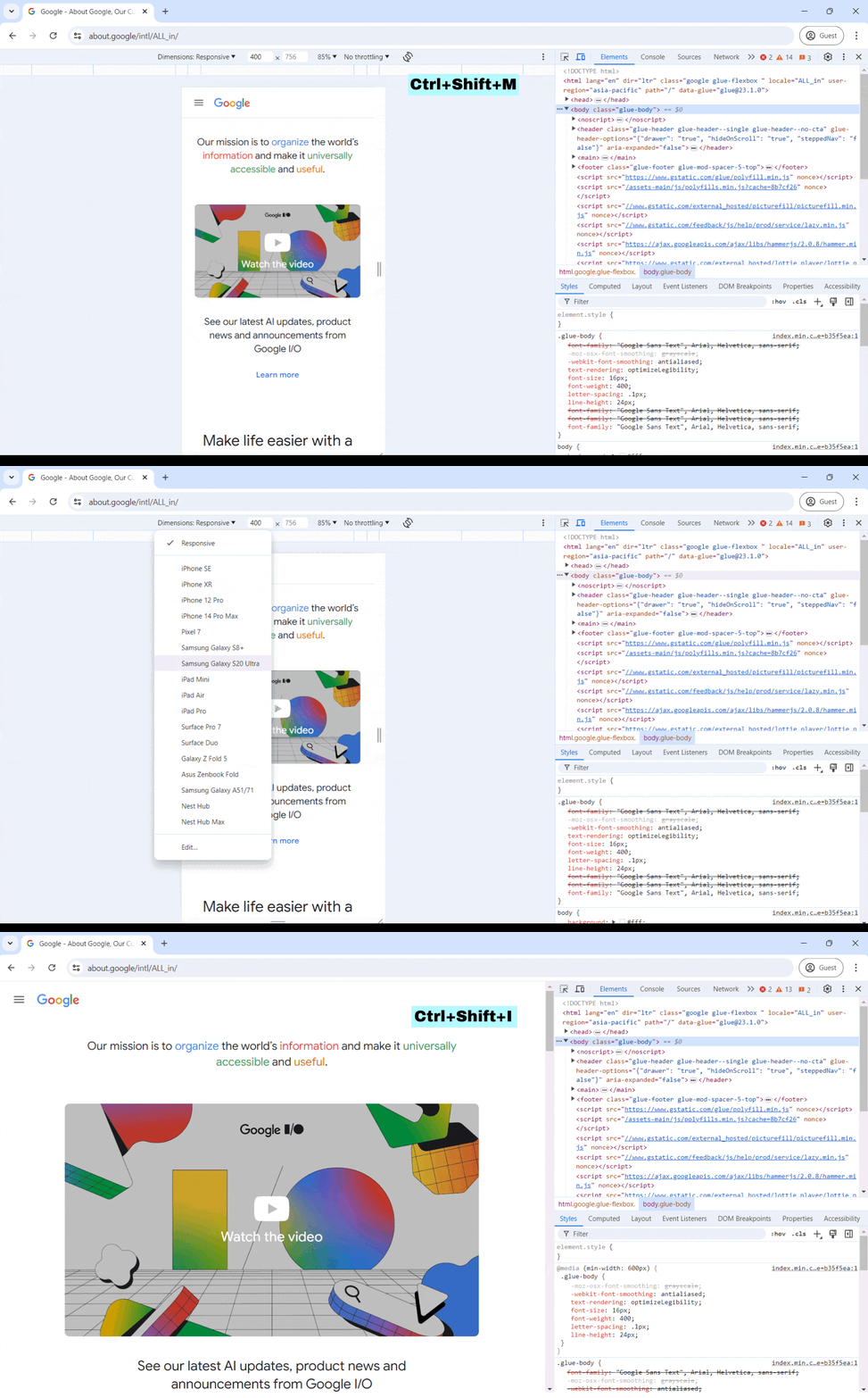
- Chrome
- Open Developer Tools (F12 or Ctrl+Shift+I).
- Click on the device toolbar icon (Ctrl+Shift+M).
- Select the device you want to emulate from the dropdown menu. You can choose from various smartphones, tablets, and custom dimensions.
- Adjust orientation and network conditions as needed to simulate different user scenarios.

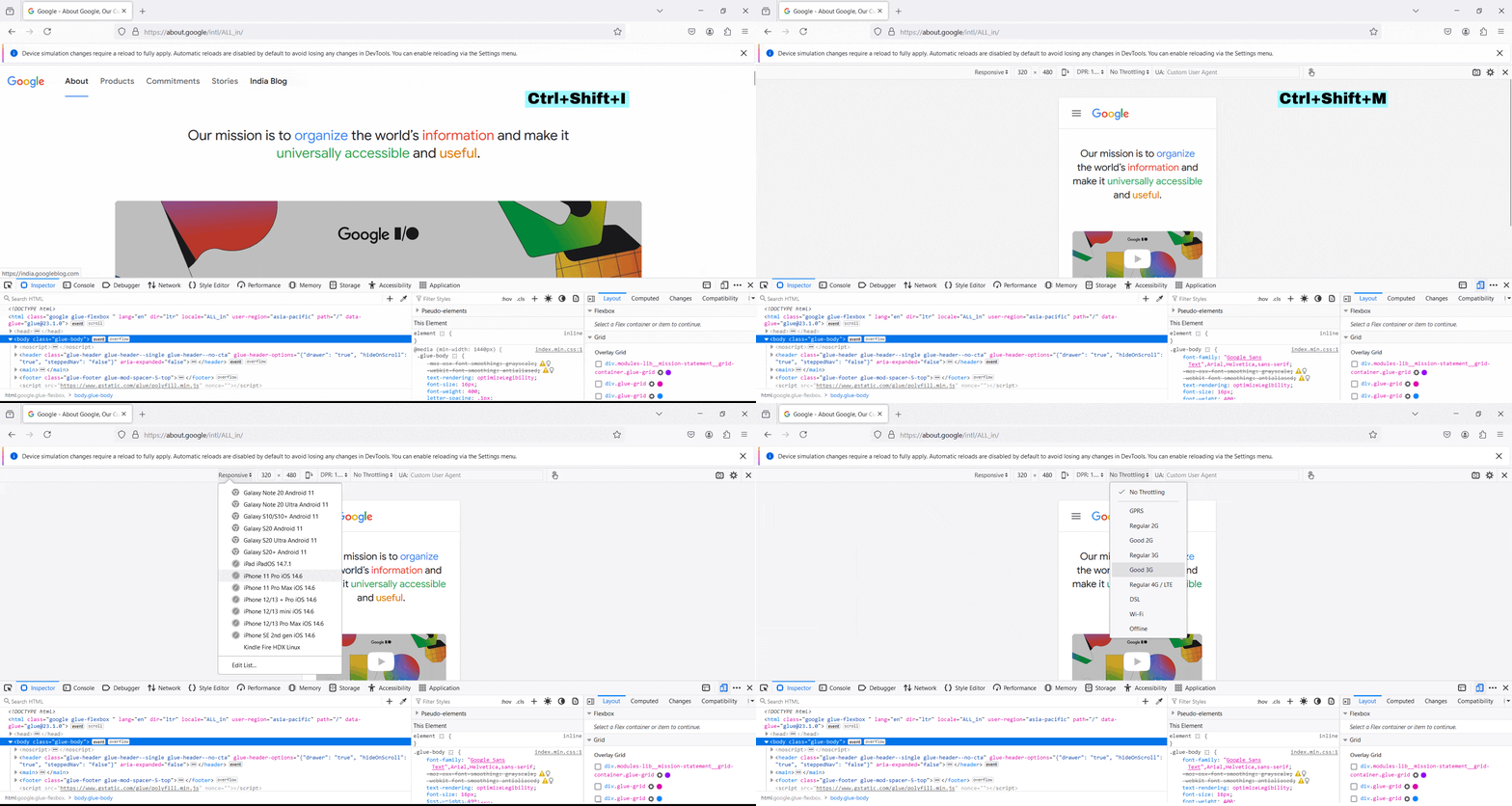
- Firefox
- Open Developer Tools (F12 or Ctrl+Shift+I).
- Click on the "Responsive Design Mode" icon (Ctrl+Shift+M).
- Choose your device from the preset options or enter custom dimensions.
- Test different network speeds and orientations to cover various use cases.

Online Responsive Testing Tools
There are numerous responsive testing tools available online which can make your process of choosing the optimal one difficult. Here are some of the prominently used and effective tools for responsive testing to ease you of the long research process:
- BrowserStack
- Provides a cloud-based platform to test your website on real devices and browsers.
- Allows you to interact with the site as if you were using a physical device.
- Offers various network conditions to test performance under different scenarios.
- Responsinator
- A quick and easy tool to see how your website looks on popular device screen sizes.
- Enter your website URL and view it on different devices side-by-side.
- Useful for a fast visual check, though it lacks the depth of interaction offered by BrowserStack.
- Google DevTools
- Integrated within Chrome, offering comprehensive emulation options.
- Simulate different devices, network speeds, and even geographic locations.
- Use the "Lighthouse" tool for performance audits and accessibility checks.
Testing on Real Devices
Responsive testing on real devices is as important as it sounds and it can be carried out either manually across real devices of different screen sizes or through simulated environments of various devices.
- Mobile Phones and Tablets
- Use a variety of personal or office devices to test your website. Cover a range of screen sizes, operating systems, and browser types.
- Check for touch interactions, load times, and overall user experience.
- Make sure to test both in portrait and landscape orientations.
- Device Labs
- Set up an in-house device lab with a collection of popular devices.
- Alternatively, use shared labs or services like Device Lab, which offer remote access to a wide range of devices.
- Regularly update your device collection to include new and popular models.
Conclusion
Responsive testing is crucial to ensure the adaptability of websites on different devices and provide a better user experience irrespective of the device used. We hope this guides provides you with the best approach to the different effective and ineffective ways of practical responsive testing.
If you enjoyed this post please follow us on LinkedIn, X and Facebook
